Every site has images. And almost every site I have audited handles them badly.
That matters more than people think. Images are tied directly to Core Web Vitals, and search engines use those metrics when ranking pages. Bad images mean slower loads, worse UX, and lower visibility. Not great for users or business.
I have been down this rabbit hole enough times that I now have a short checklist. Here is what actually moves the needle.
1. Lazy loading (only load what people see)
Lazy loading means you do not load every image on the page at once. You load what is in the viewport first, and defer the rest until the user scrolls near them.
Think about an e commerce product grid. Hundreds of product photos, but the user might only scroll halfway. Why load images they will never see?
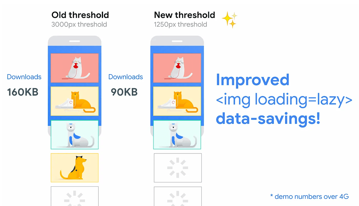
In HTML, it is one attribute:
<img src="images/image.jpg" loading="lazy" width="300" height="300" />The loading attribute options:
- auto: Default browser behavior. Same as omitting the attribute.
- lazy: Defer until the image is near the viewport.
- eager: Load immediately, regardless of position.
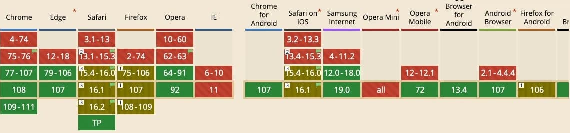
Browser support is solid now:
2. Preload what actually matters
Preload tells the browser: "Hey, load this critical resource early."
Useful for things that are hard to discover in HTML, like fonts in stylesheets, hero background images, or assets loaded from scripts.
Example:
<link rel="preload" as="image" href="wolf_1600.jpg" />Before
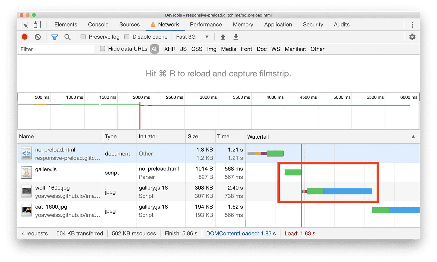
After
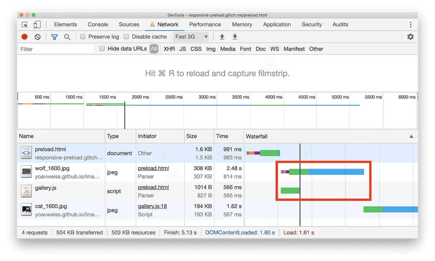
Notice how the image loads before other assets. That is the point.
3. Pick the right format
Format choice matters more than people admit.
For vector graphics, SVG is usually the move. It scales without losing quality, which is great for responsive layouts.
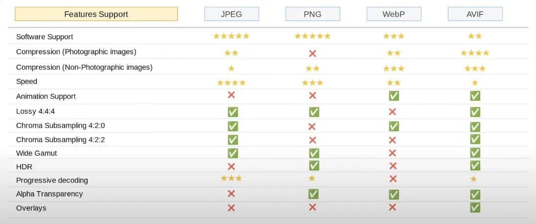
For raster images, WebP or AVIF are what I reach for. Google’s own numbers put WebP lossless compression around 26% smaller than PNG, and lossy around 25 to 34% smaller than JPEG. On image heavy sites, that adds up fast, especially on mobile.
The comparison:
My go to tool for converting to WebP: https://squoosh.app
4. Always set width and height
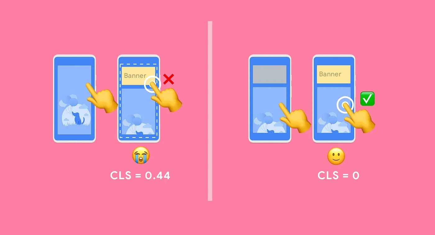
You know that feeling when you are reading an article and the whole page jumps because an image finally loaded? That is layout shift, and it is annoying.
Fix it by always setting width and height on images and videos. Or reserve space with a CSS aspect ratio box. The browser can then allocate space before the image arrives, which helps your Cumulative Layout Shift score.
5. Do not skip alt text
Alt text helps accessibility when images fail to load, and it helps SEO when people search for images on Google.
Example:
<img src="images/persia_cat.jpg" alt="A Persia Cat" width="300" height="300" />Small thing. Easy win.
The short version
Images are not just decoration. They affect speed, rankings, and whether users stick around.
My usual order: lazy load what is off screen, preload what is critical, use modern formats, set dimensions, and write alt text.
None of this is revolutionary. But I still see sites skip all five. Do not be that site.
Thanks for reading!